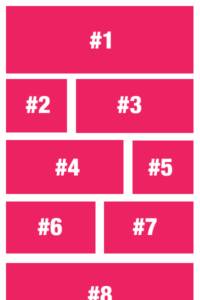
Variable Post Grid Layout
Code
How hard is it to create a variable post grid? Not that hard with Toolbox and UIkit.
This question was asked in the Beaver Builder Facebook Forum, and some answers included adding 3 different modules to the layout; Could work, but using Toolbox and UIkit’s CSS grid you can do this easily in any combination you desire and for multiple breakpoints.
The challenge
If you only tell the module to fetch 9 items and display in a 3 column grid on desktop, your layout will look wonky if you add a breakpoint for tablet screen that can have a 2 column grid. There will be one item (the last one) on it’s own. So you will need to keep that in mind.
That’s actually my biggest concern when I saw people wanting to solve this with 3 seperate modules. It might look OK on desktop, but there’s only one way out of this for smaller screens, and that’s fall back to a single column.
Using Toolbox to solve it
First, we will create a variable bplayouts, where we can store the settings for the mobile, tablet and desktop layout.
{% set bplayouts = {
				   'desktop': [ '1-1' , '2-3', '1-3' , '1-3' , '2-3' ],
				   'tablet': [ '1-1' , '1-2' , '1-2' ],
				   'mobile' : [ '1-1' ]
	   }
%}
The settings will be inserted as part of the UIkit grid-classes. 1-1 is a full width item, 1-2 is half-width, 1-3 is one-third width, and so on.
For each breakpoint, set the pattern of the grid. You can have just one item in the pattern, or you can add as many as you want. We will make sure that the pattern is repeated until we run out of posts.
Please note that you don’t have to create full-row patterns. You can have a single
1-3layout for desktop, and it will be used for each and every item in the posts array.
Getting the number of options
In order for the pattern to tile as we go, we will be using the modulo math operation. But to make it a little more readable we will add the number of options as separate variables.
{% set bplayouts = {
				   'desktop': [ '1-1' , '2-3', '1-3' , '1-3' , '2-3' ],
				   'tablet': [ '1-1' , '1-2' , '1-2' ],
				   'mobile' : [ '1-1' ]
	   }
%}

{% set mobileoptions = bplayouts.mobile|length %}
{% set tabletoptions = bplayouts.tablet|length %}
{% set desktopoptions = bplayouts.desktop|length %}
Each of these variables will be the number of options we have set and will be used to loop over the items later on.
Looping over the posts items
Make sure the Toolbox Timber Posts Module returns posts, so we can loop over them. A simple for .. endfor loop will suffice.
{% set bplayouts = {
				   'desktop': [ '1-1' , '2-3', '1-3' , '1-3' , '2-3' ],
				   'tablet': [ '1-1' , '1-2' , '1-2' ],
				   'mobile' : [ '1-1' ]
	   }
%}

{% set mobileoptions = bplayouts.mobile|length %}
{% set tabletoptions = bplayouts.tablet|length %}
{% set desktopoptions = bplayouts.desktop|length %}

{% for item in posts %}
    {# // rest of markup goes here #}
{% endfor %}
Setting each item’s classes
Using UIkit you can set the each item’s width at different breakpoints. Using class uk-width-1-3@s will make the item use one-third of the screen width if the screensize is at least 640 pixels wide. Adding an additional uk-width-1-4@l (lowercase letter L) will make that same item one-fourth when the 1024 pixels screen breakpoint has been reached. Ommiting the @{size} completely tells it what width to use as a fallback, which we will use for the mobile size.
Let’s start with setting the desktop item’s width first. We will use the module operation here.
In computing, the modulo operation finds the remainder after division of one number by another (called the modulus of the operation).
https://en.wikipedia.org/wiki/Modulo_operation
We will use this to devide the loop.index0 value for our loop (which is added automatically and only exists within the loop-scope) to get the remainder after devision by the number of desktopoptions.
| loop.index0 | desktopoptions | modulus | resulting grid width |
|---|---|---|---|
| 0 | 5 | 0 | 1-1 |
| 1 | 5 | 1 | 2-3 |
| 2 | 5 | 2 | 1-3 |
| 3 | 5 | 3 | 1-3 |
| 4 | 5 | 4 | 2-3 |
| 5 | 5 | 0 | 1-1 |
| 6 | 5 | 1 | 2-3 |
If you look at the table above, you see that when the loop.index0 value hits 5 (our sixth item, because index0 is zero-based), the modulus is 0 again. This is what we want, so we can get the nth item of our layout-pattern as we go.
{% set bplayouts = {
				   'desktop': [ '1-1' , '2-3', '1-3' , '1-3' , '2-3' ],
				   'tablet': [ '1-1' , '1-2' , '1-2' ],
				   'mobile' : [ '1-1' ]
	   }
%}

{% set mobileoptions = bplayouts.mobile|length %}
{% set tabletoptions = bplayouts.tablet|length %}
{% set desktopoptions = bplayouts.desktop|length %}

{% for item in posts %}
    {{ loop.index0 % desktopoptions }}
{% endfor %}
Depending on the number of items in the posts variable, it will return a list of 012340123401234
Now let’s put that returned number to use to return the pattern settings:
{{ bplayouts.desktop[ loop.index0 % desktopoptions ] }}
This will return the nth value of the bplayouts.desktop variable on each loops pass.
If you examine closely, you can see that we use the same structure to also get the tablet and mobile modules values, and use it to get the pattern. Regardless of the number of items in the pattern, the modulo operation will get the next item for it’s layout.
This is what that same line would like on the first item in the loop:
The rest of the layout
Now that we have our most important parts ready, we can add our item’s markup. You might look into some of the other code examples for help on how to return markup for images, but here’s the completed template:
{% set bplayouts = {
'desktop': [ '1-1' , '2-3', '1-3' , '1-3' , '2-3' ],
'tablet': [ '1-1' , '1-2' , '1-2' ],
'mobile' : [ '1-1' ]
}
%}
{% set mobileoptions = bplayouts.mobile|length %}
{% set tabletoptions = bplayouts.tablet|length %}
{% set desktopoptions = bplayouts.desktop|length %}
{% for item in posts %}
 {{item.title}}
{{item.preview(60).read_more( '' )}}
{% endfor %}
{{item.title}}
{{item.preview(60).read_more( '' )}}
{% endfor %}
Advanced Toolbox
You can also copy this into the Twig Template CPT and include this in a Timber Posts Module using {% include 'variable-posts.twig' %}. Of course you need to use YOUR Twig Template’s slug instead of ‘variable-posts’ to work, but this way you will be able to re-use your twig easily and safely.

Beaverplugins
Web ninja with PHP/CSS/JS and Wordpress skills. Also stand-in server administrator, father of four kids and husband to a beautiful wife.Always spends too much time figuring out ways to do simple things even quicker. So that you can benefit.