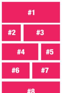
How hard is it to create a variable post grid? Not that hard with Toolbox and UIkit.
This question was asked in the Beaver Builder Facebook Forum, and some answers included adding 3 different modules to the layout; Could work, but using Toolbox and UIkit’s CSS grid you can do this easily in any combination you desire and for multiple breakpoints.
The challenge
If you only tell the module to fetch 9 items and display in a 3 column grid on desktop, your layout will look wonky if you add a breakpoint for tablet screen that can have a 2 column grid. There will be one item (the last one) on it’s own. So you will need to keep that in mind.
That’s actually my biggest concern when I saw people wanting to solve this with 3 seperate modules. It might look OK on desktop, but there’s only one way out of this for smaller screens, and that’s fall back to a single column.
Using Toolbox to solve it
With Toolbox you can easily create any layout you need, with a single, simple template:
{% set options = {
'desktop': [ '1-1' , '2-3', '1-3' , '1-3' , '2-3' ],
'tablet': [ '1-1' , '1-2' , '1-2' ],
'mobile' : [ '1-1' ]
}
%}
{% set mobileoptions = options.mobile|length %}
{% set tabletoptions = options.tablet|length %}
{% set desktopoptions = options.desktop|length %}
{% for item in posts %}
.src('large')}}") {{item.title}}
{{item.preview(60).read_more( '' )}}
{% endfor %}
{{item.title}}
{{item.preview(60).read_more( '' )}}
{% endfor %}
The first part of the Twig sets the options variable that we are going to use to do some magic. It’s also used to set the layout we are going to use:
For desktop we see a 1-1 , 2-3 + 1-3 , 1-3 + 2-3 layout; Which means we are templating 3 rows, the first one full width, the second row two columns and the third one also 2 columns. You can add more variations if you want but this template will be applied to the first 7 posts and continue to loop each consecutive post.
For tablet we see something similar, although much simpler. First post on a single row, next 2 side by side on a row and repeat after that.
The mobile view consists of only a single item per row.
How does this work?
Very little math is needed for this to work. If you look further in the Twig, you will find a line with the following:
{% set desktopoptions = options.desktop|length %}This line stores the number of settings used for our desktop template so we can use it in a more readable way later on, namely here:
uk-width-{{ options.desktop[loop.index0 % desktopoptions] }}@lYou might remember the modulo operator from math class. It is used to calculate the remainder of an integer division and will return a number corresponding to the options.desktop setting. using this number and echoing the needed portion of the CSS class that creates a 1-1 column we can very easily add it for each item.
We can also do the same for tablet and mobile, which we do, as you’ve probably derived from the code.
Advanced Toolbox
You can also copy this into the Twig Template CPT and include this in a Timber Posts Module using {% include 'variable-posts.twig' %}. Of course you need to use YOUR Twig Template’s slug instead of ‘variable-posts’ to work, but this way you will be able to re-use your twig easily and safely.